Brand identity · Excavation & earthworks

Schafer Industries brand.

A new identity for an excavation and earthworks company: four logos, one colour palette, two typefaces and the rules for signage, trucks, uniforms and social. Version 1.0, issued October 2026.

Brand guidelines

All eight pages.

Every logo, colour and typeface has a job, written down so the brand looks the same on a hard hat, a truck door and a phone screen.

Download the PDF (3.5 MB) Back to all work
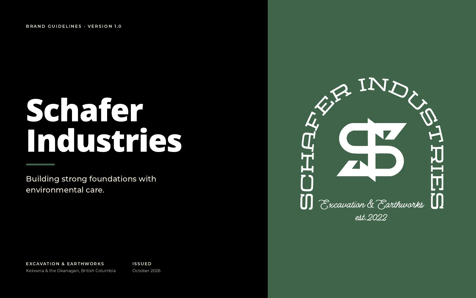
Cover: Schafer Industries brand guidelines, version 1.0, with the arch badge in white on forest green
01 / 08
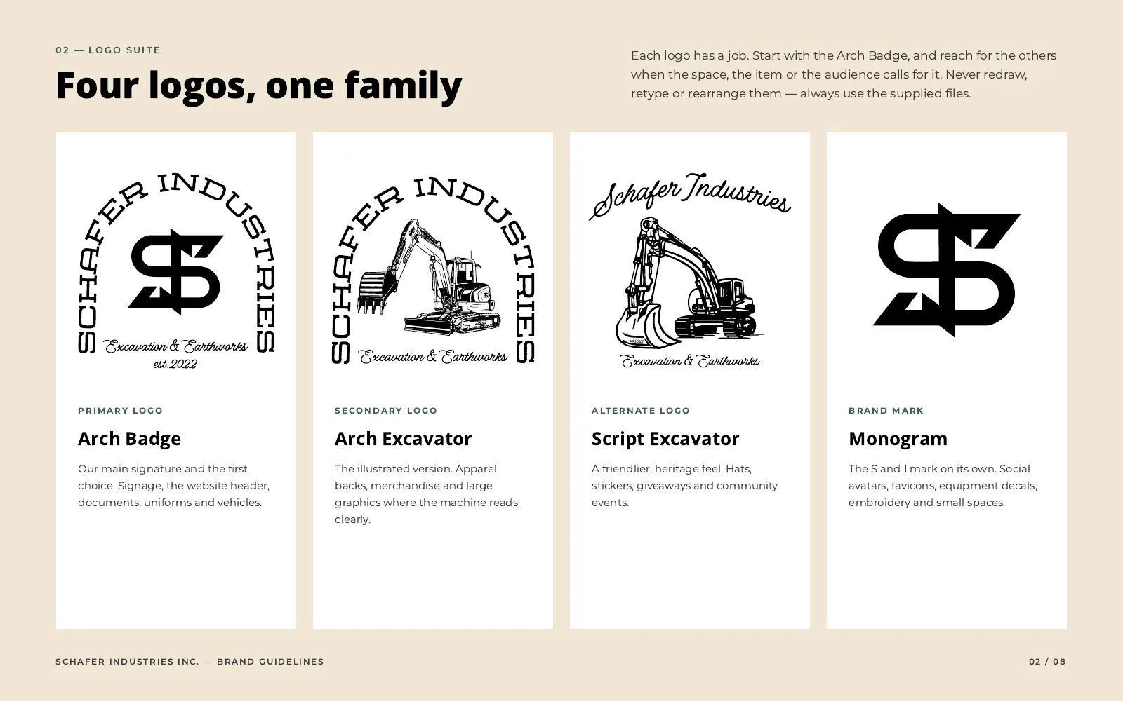
Logo suite: the Arch Badge, Arch Excavator, Script Excavator and the S and I monogram
02 / 08
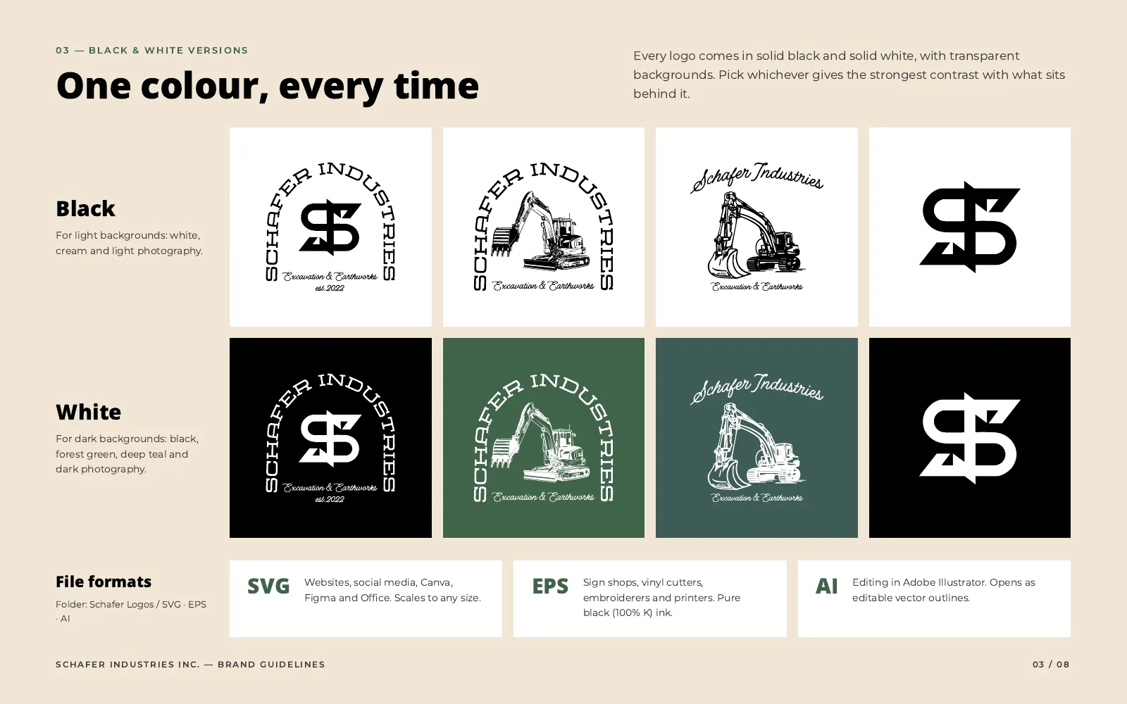
Black and white versions of all four logos, with the file formats
03 / 08
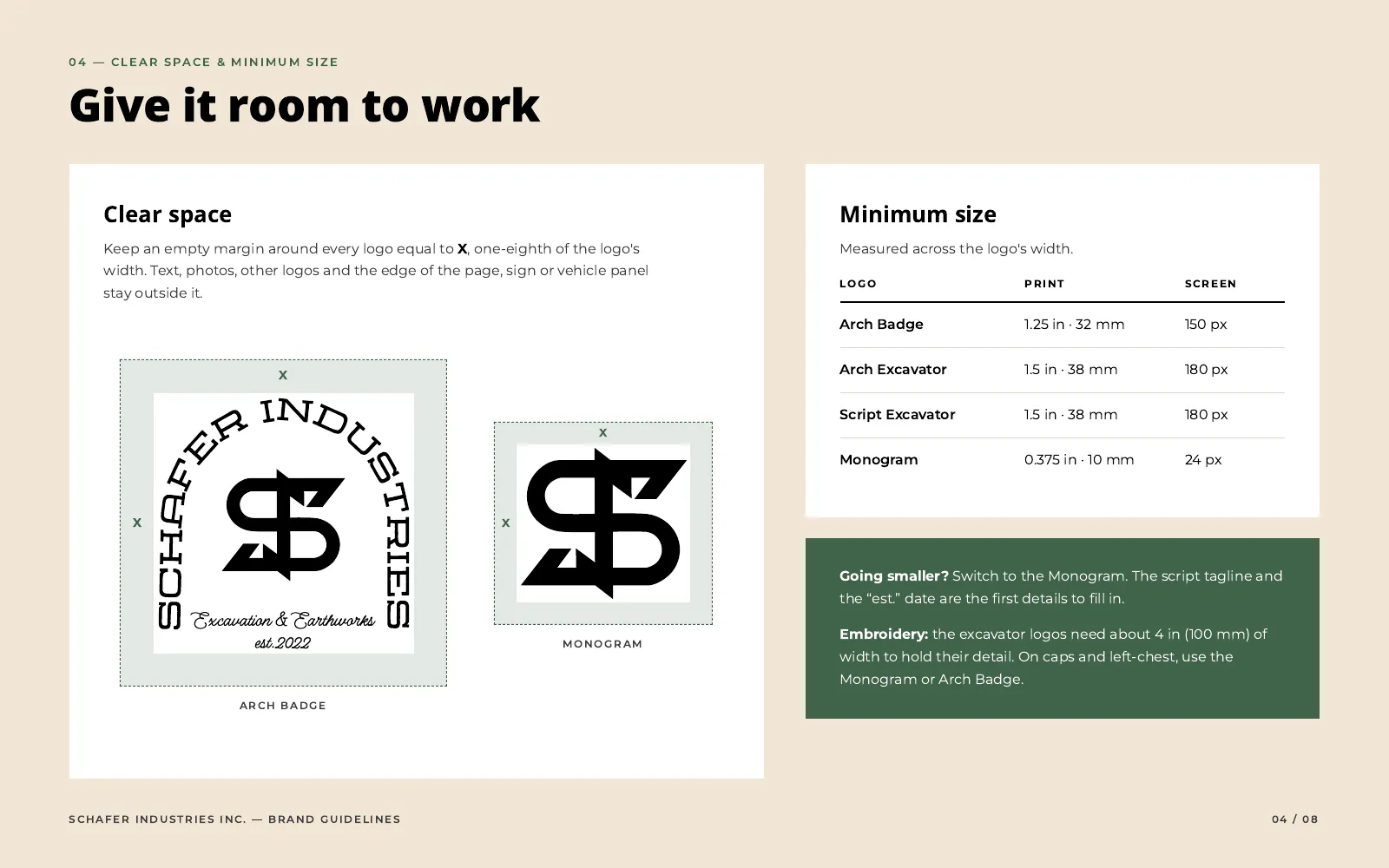
Clear space and minimum sizes for print and screen
04 / 08
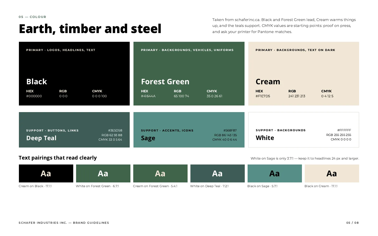
Colour: Black, Forest Green and Cream lead, with Deep Teal, Sage and White in support
05 / 08
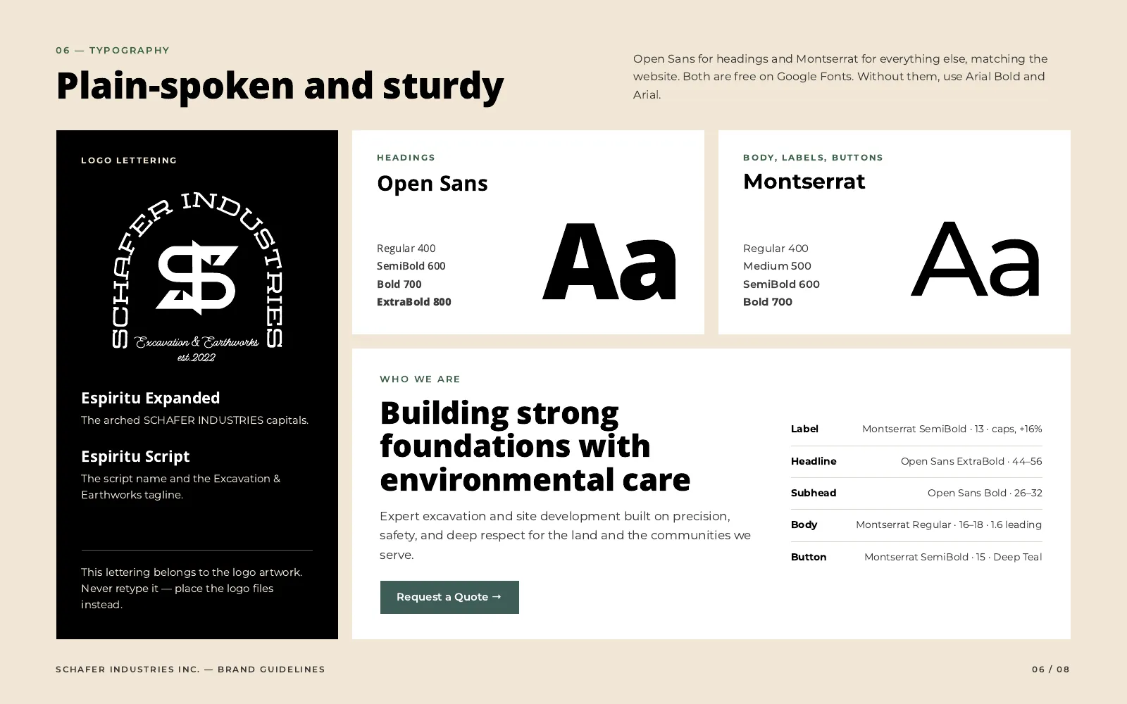
Typography: Open Sans for headings and Montserrat for text, with the logo lettering
06 / 08
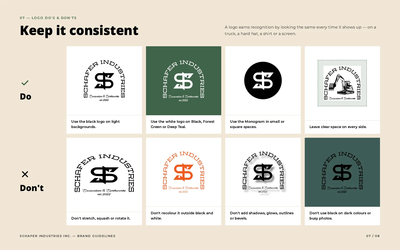
Logo do's and don'ts
07 / 08
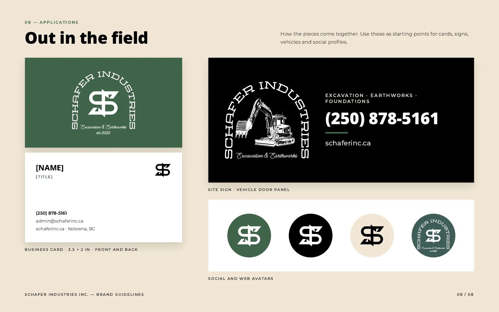
Applications: business card, site sign and vehicle door panel, and social avatars
08 / 08

Let's talk

Want a brand like this?

Book a call and I'll come back with a plan, a fixed price and a timeline, in writing.